Pluriel
A bilingual one-page site for a merged architecture practice, built on its existing identity.
SB Architecture Inc. merged with Pluriel and began operating under the Pluriel Architecture name. I turned the existing identity into a clear bilingual site for the new combined practice.
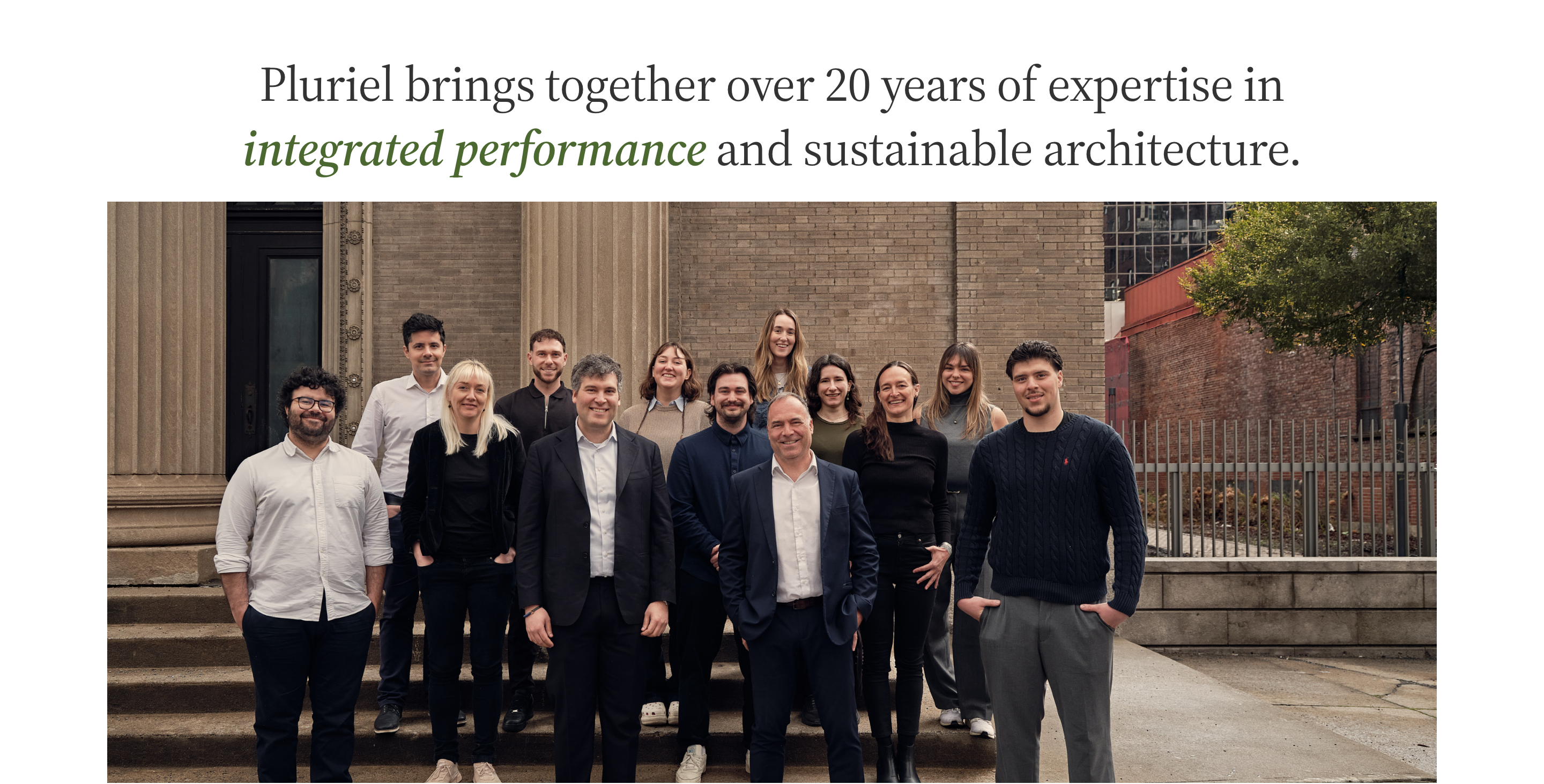
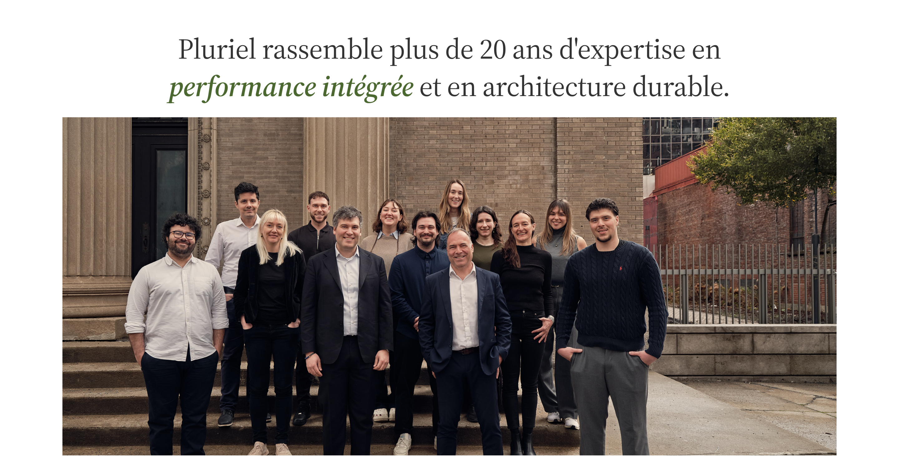
Give the new practice a clear place to exist
The identity was already there: logo, colors and typography. I took ownership of the structure, hierarchy and visual direction that would turn it into a working website.
The starting brief was one page: a short statement about the merger, selected projects, the combined team and contact information, with French and English carrying equal weight.
Turn the existing identity into website rules
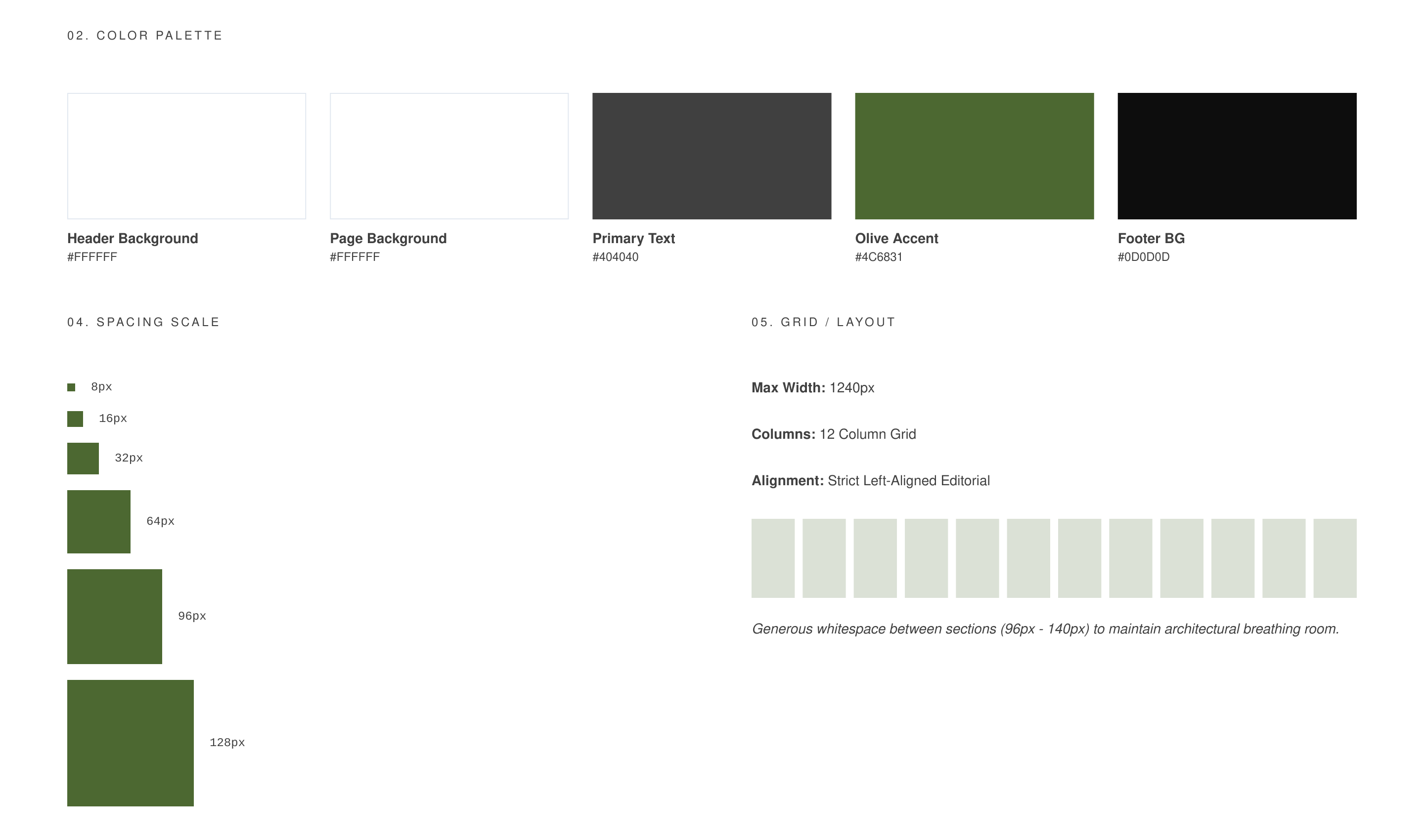
Before designing the page, I documented the identity from the existing Pluriel site and turned it into rules a website could run on: olive as the only accent, Source Serif 4 italic for section headings, Figtree Light for statements, a spacing scale and a 12-column grid.
The rules said what not to do as well: no rounded corners, no SaaS-style cards, no shadows, and the language switch always in view.
Start basic, then refine what actually needs refining
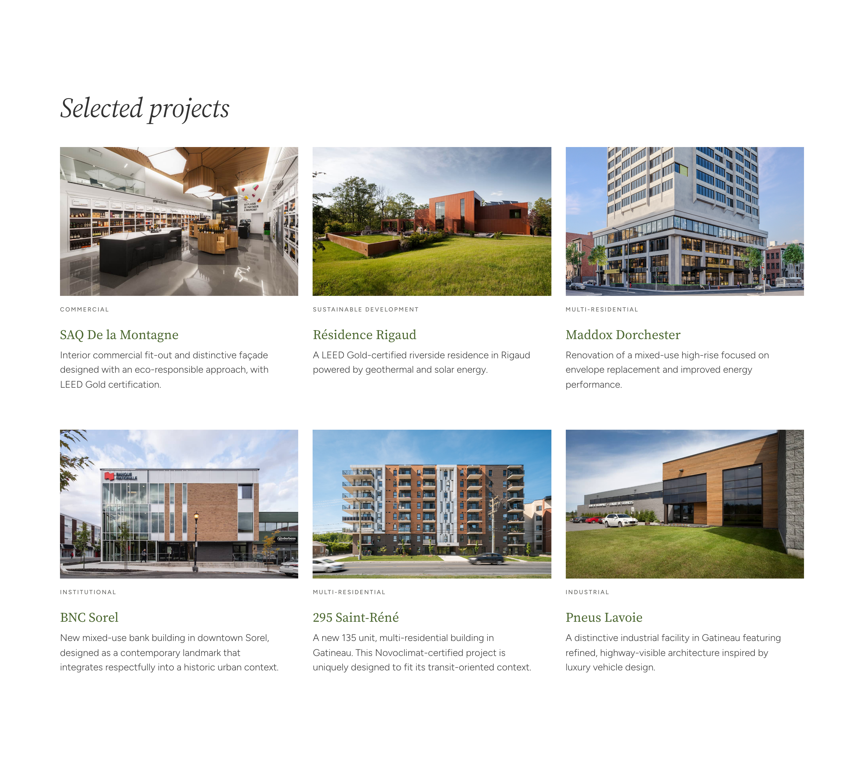
I started with V1, a deliberately basic version that matched the brief, in French and English, and got the structure in front of the client quickly.
V2 added services, the practice’s values and where the practice works. V3 kept those sections and added a short merger announcement under the hero. The design versions use placeholder photography.
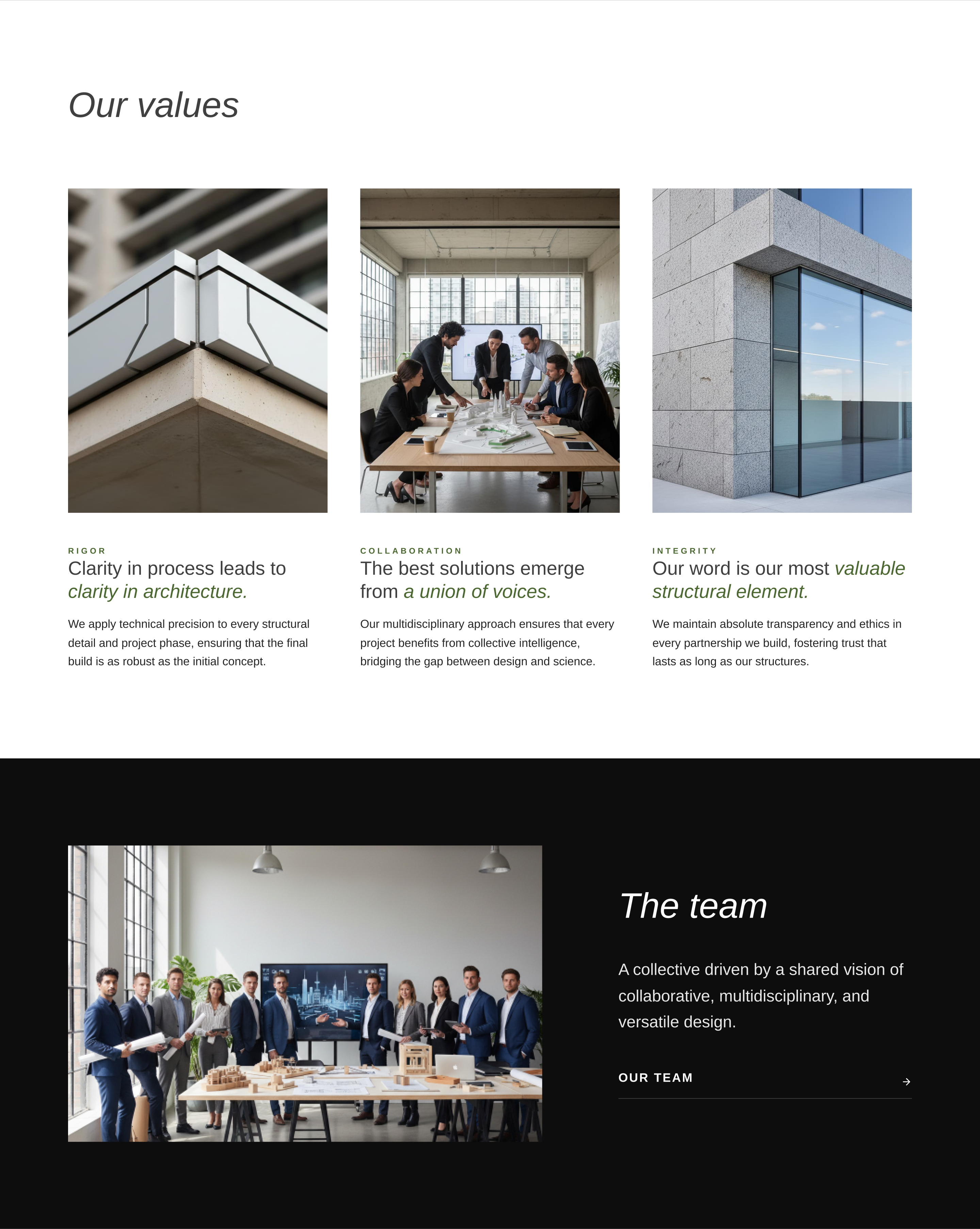
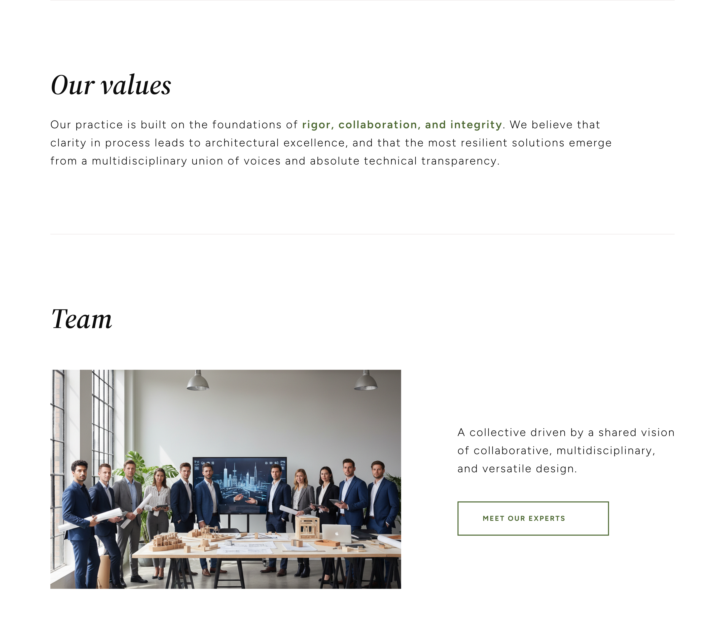
- The identity was already set. The real work was adapting it as the content developed, so a page that outgrew its brief still looked like Pluriel.