Kash Rupareliaa
One personal brand, one working funnel, every path tested until it delivered.
Kash had three strong brand directions. I found what was worth keeping, made the decisions between them and turned them into one coherent live site. Then I tested every conversion path all the way through.
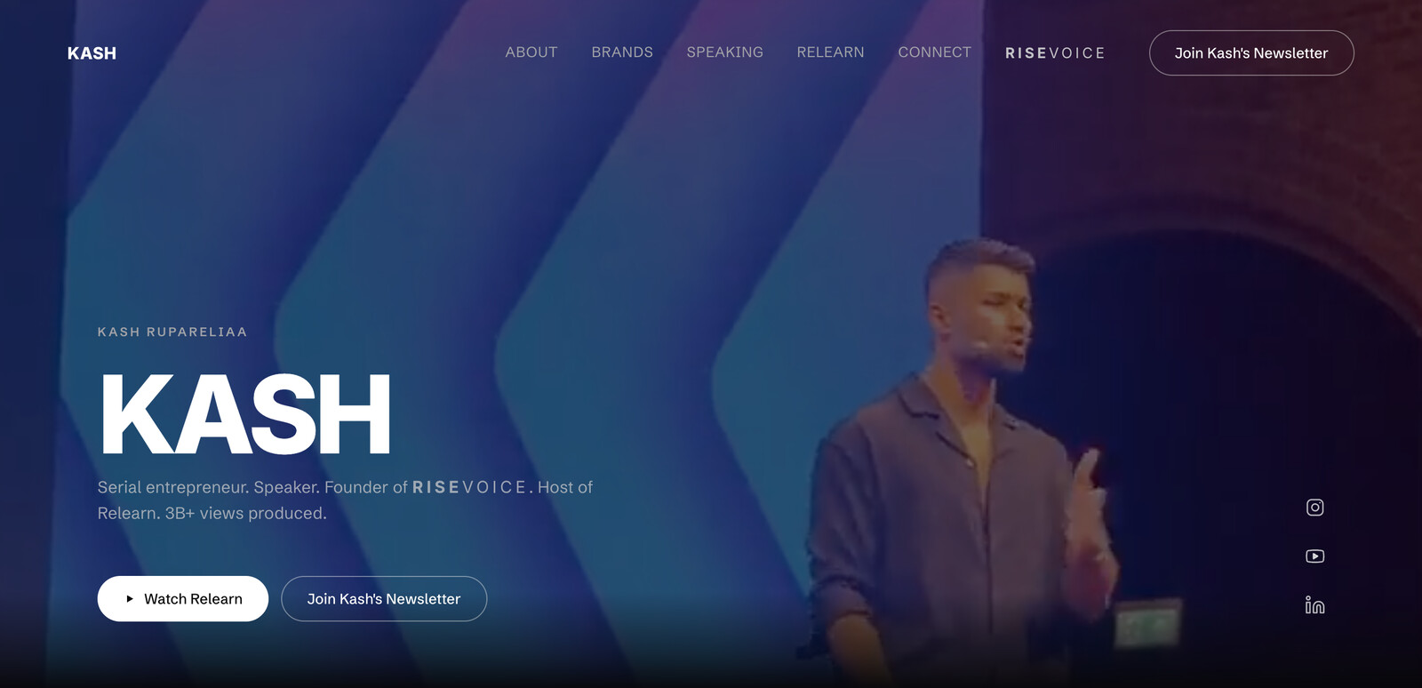
Three directions. One person at the centre.
Kash sits across several things at once: RiseVoice, Relearn, and his own voice as a founder and host. I reorganised the brand around the person connecting everything: Kash.
I pulled the decisions that kept surviving from one exploration to the next and dropped the rest. The visual system stayed deliberately black and white around his commissioned wordmark. I built the story around what Kash could prove.
This was partly brand direction and partly product strategy. Before adding anything else, I decided what the website was actually for.
Attention needed somewhere useful to go.
A personal-brand site can become a scrapbook very quickly. I treated this one more like a small product: understand who has arrived, give them enough context, then give them the right next step.
Newsletter readers, podcast enquiries, speaking opportunities and general brand enquiries each needed a clear next step. I structured the site around those paths while keeping the experience visually simple.
- Kash firstRiseVoice and Relearn support his story instead of competing with it.
- One visual languageBlack, white, photography and the existing wordmark instead of another layer of branding.
- One inboxSix forms route into one destination, with enough context to know what each person actually wants.
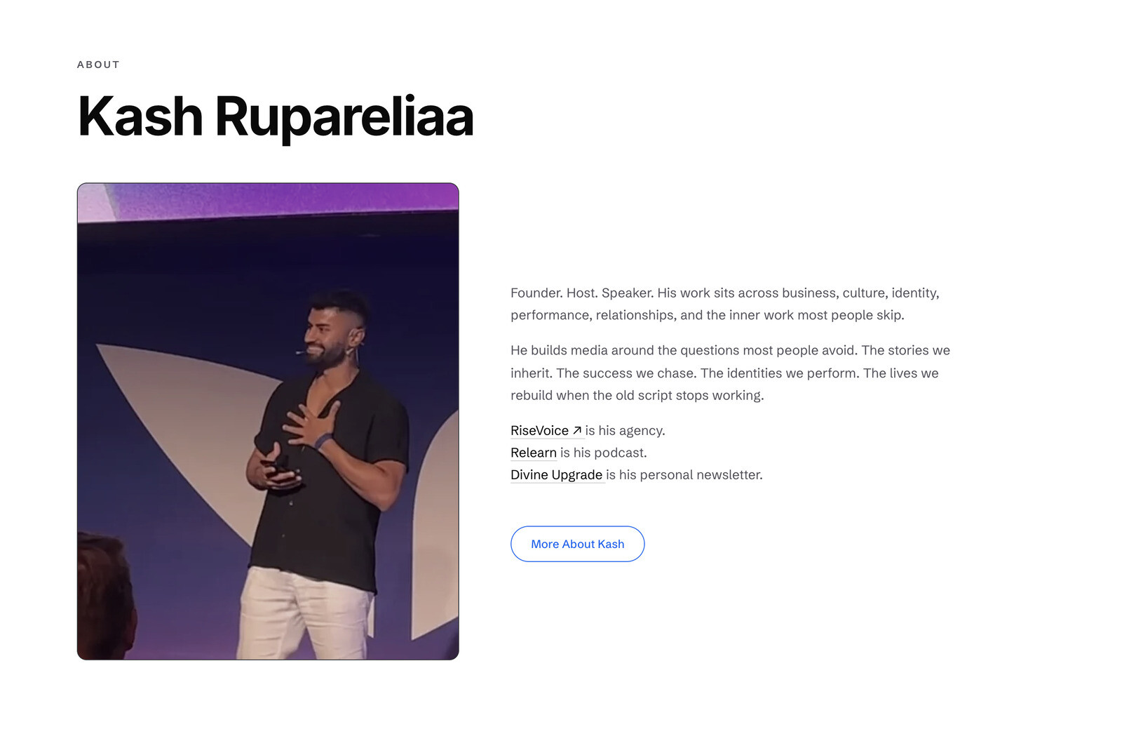
Designing it was only half the job.
I designed and built the site in React with TanStack Start and Cloudflare.
Once the visible work was in place, I tested every route, form, state and edge case I could get my hands on.
That meant catching interaction timing issues, normalising confirmation patterns, making enquiry subjects reflect the path someone chose, and auditing the legal and utility pages with the same attention as the homepage. If the interface said something had happened, I wanted the system behind it to prove it.
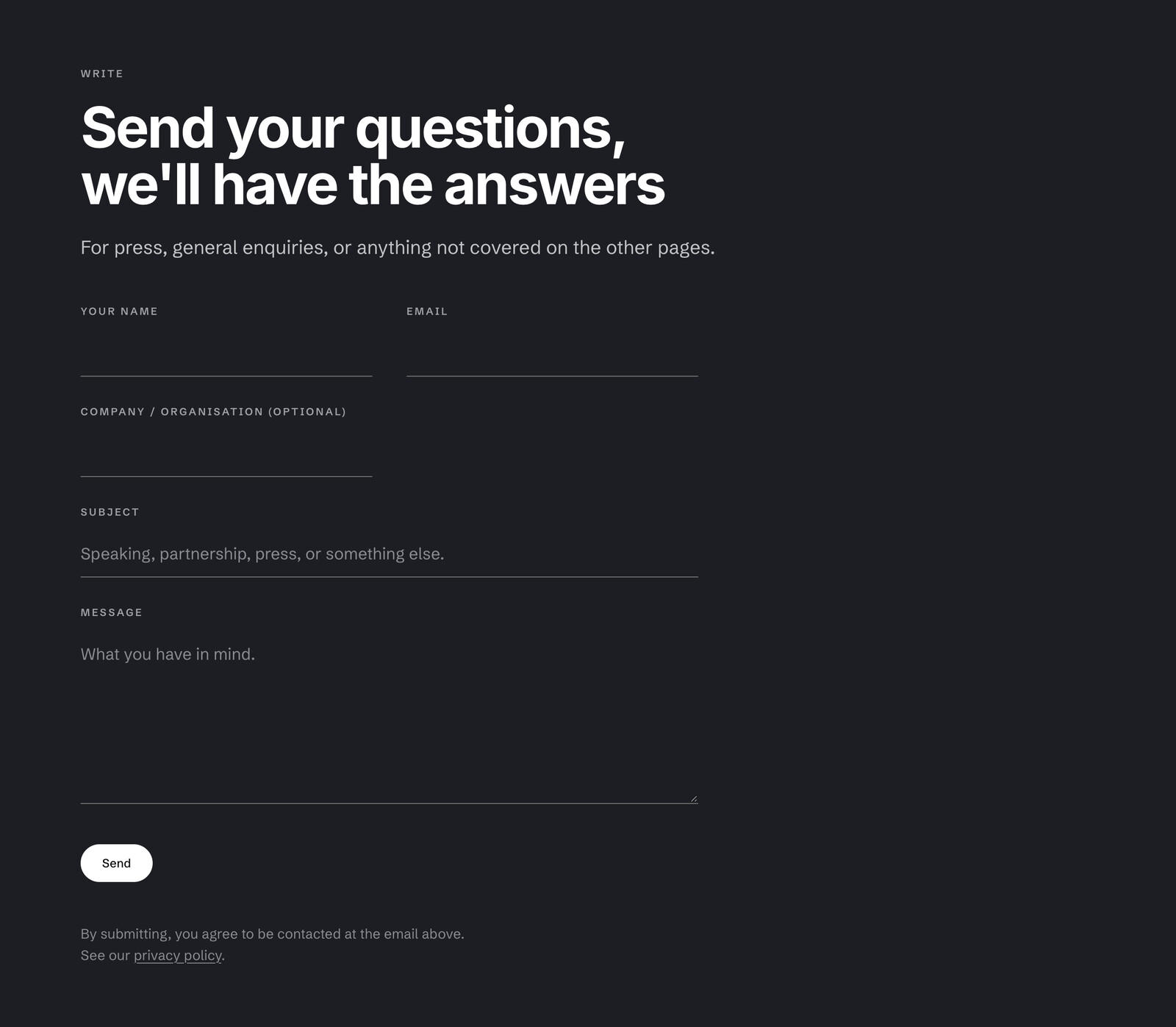
If the site said it worked, I wanted to know it actually had.
I wired both newsletter paths into Mailchimp with secrets kept server-side, source-specific audience tags, correct resubscribe behaviour and end-to-end testing. One person creates one real contact, with the right source attached, and the confirmation only appears once the system has done the work.
I treated the enquiry pipeline the same way. I traced delivery through the domain, provider, route and queue, then kept the simplest path I could verify end to end. Failures stay visible instead of disappearing into a background process.
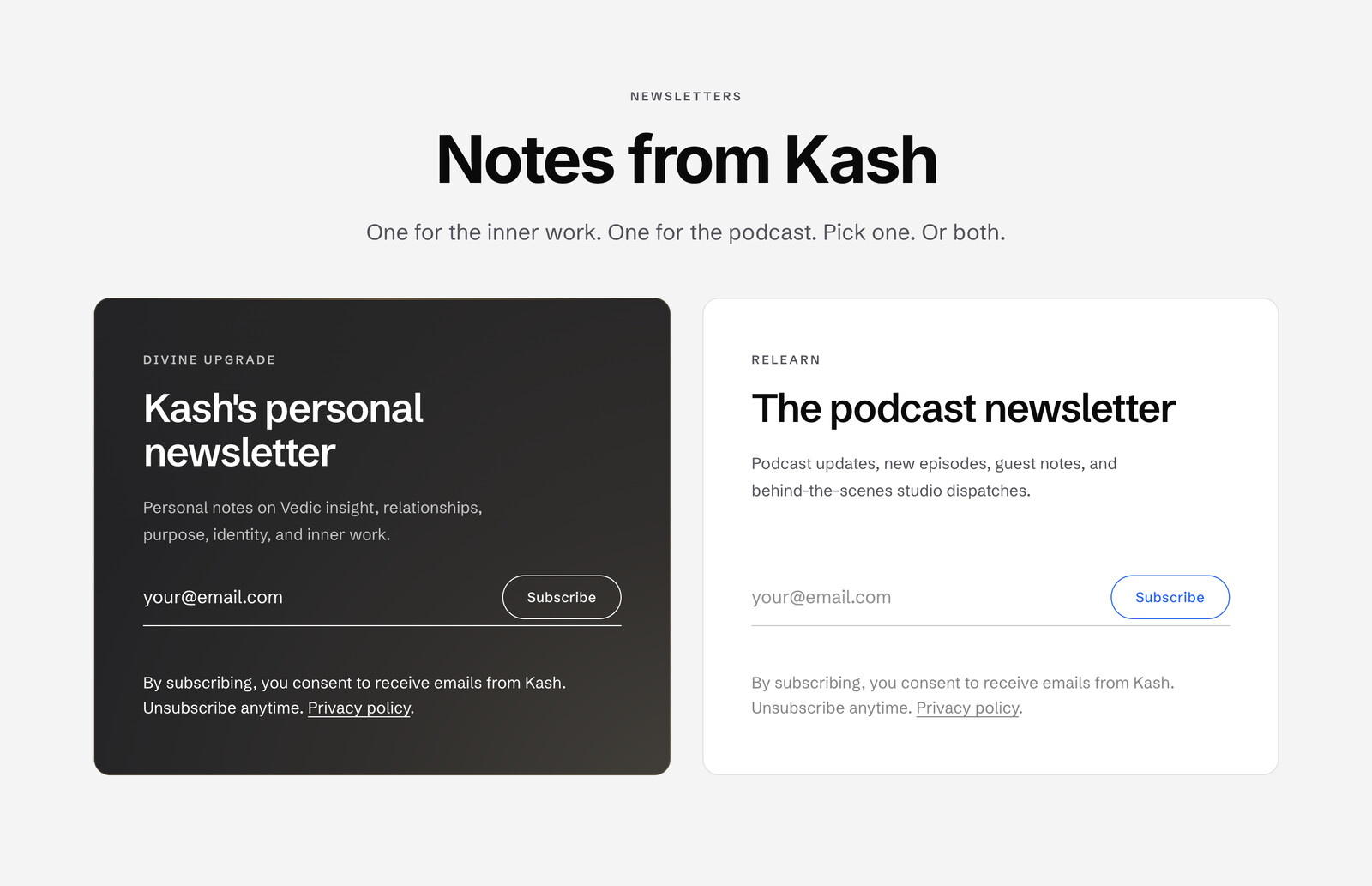
100+real newsletter signups, attributable by source
6enquiry forms feeding one triage-ready inbox
3 → 1brand directions turned into one live personal-brand system
- The best CRO decision here was making fewer promises and verifying every one that remained.
- A success message is a claim. The system behind it still has to prove it.