Equalista
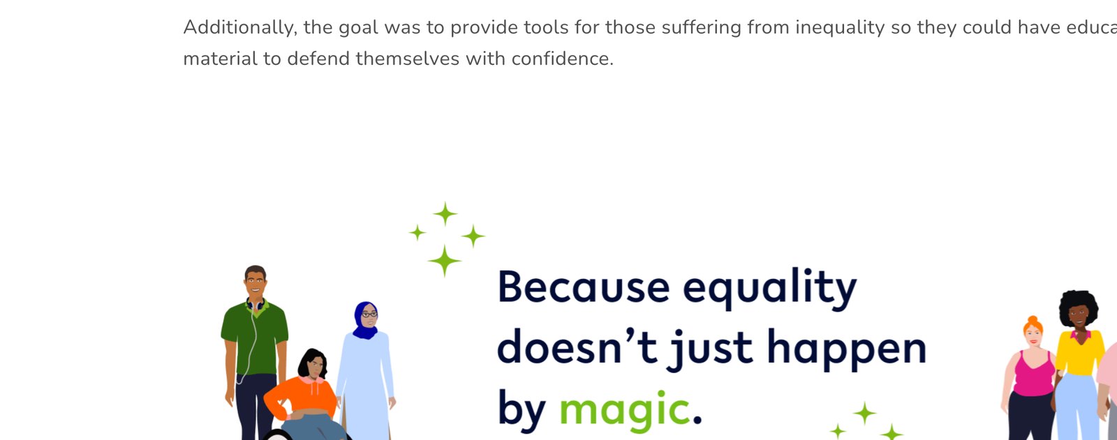
Because equality doesn’t just happen by magic.
Case Study auf Englisch
Equalista is the world’s first gender equality learning app — bootstrapped, women-led, built in Germany. I joined before it launched, to design it and to build the frameworks it was built on.
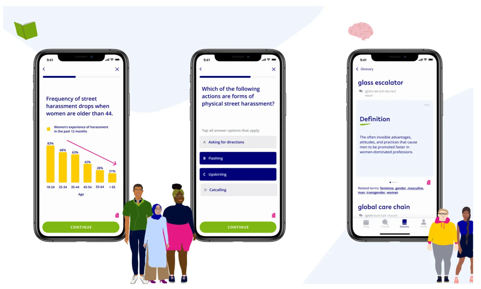
An app about bias, for everyone
Equalista was building a learning app for a subject where the wrong tone loses the reader inside a sentence. Small team, all women, mostly remote, with no close market precedent.
The audience: anyone who wants to identify their own biases. The named traps: corporate appropriation, white neoliberal feminism, equality framed as an individual problem. The brief was designing around all three.
- Design for a very diverse audience without diluting the message.
- Educate with kindness — tools to check yourself, tools for people experiencing inequality.
- No red for feedback — find another way to signal “incorrect”.
- Build gamification that motivates without feeling cynical.
- Guide junior designers while the product was still being defined.
- Give the product a system it could keep growing into.
It is important to accept that everyone has their own biases — but how do we identify them?
Seven months shaping the MVP
I joined the MVP team for seven months and stayed through the whole build, from early product decisions to what launched. I already knew EdTech, which meant I could help shape the learning model as well as the interface around it.
- Designed the productScreens, flows and states across the learning experience.
- Built a gamification frameworkFreemium, gradual learning, avatars, special effects, timer, points, levels, badges.
- Built a microlearning frameworkTask types, media formats, length, flashcards, quizzes, task results, re-dos, refreshers, mastery.
- Mentored the junior designersReviewed and coached from low-fi to launch-ready high-fi.
- Taught the teamSessions on motivation, design biases, and gamification inside an app.
- Shaped the visual systemThe look the product carried into launch.
One research foundation, shared
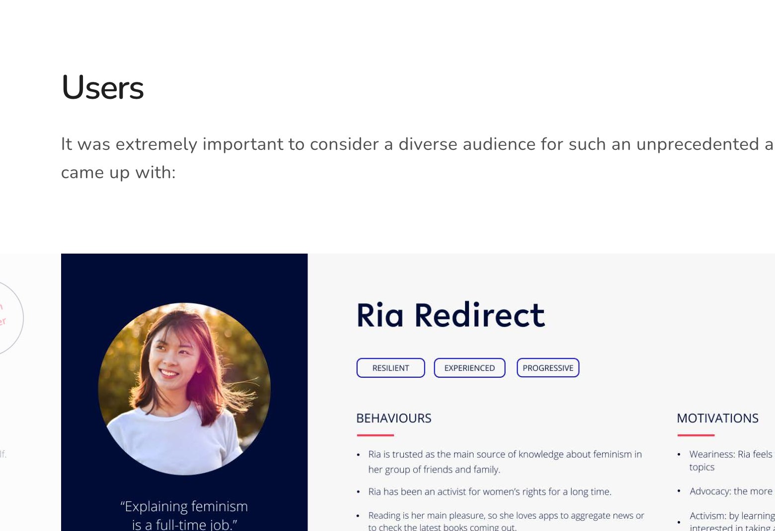
We analysed 100+ competitor apps and narrowed the useful references to ten — Headspace, Duolingo, Khan Academy, Quizlet. We worked lean, with testers pulled from Equalista’s own channels, and five personas, Ria Redirect to Desiree Dazzled.
I used that research to shape the product: motivation, gamification and microlearning decisions, plus frameworks the team could keep applying after launch.
Frameworks the team could keep using
Three reusable systems: a gamification framework, a microlearning framework, and feedback colours swapping red — too close to warning for content this sensitive — for a green-blue pair.
All three had to outlive the engagement. Tools the team could apply to courses nobody had written yet. Work that keeps compounding after launch.
What shipped
Glossary swipe cards — misogyny, mansplaining, glass escalator — short interactive courses on street harassment, emotional labour and the glass ceiling, and an engagement model built on the two frameworks.
The system underneath: Lelo headlines, Open Sans body, Major Third typescale, 8dp grid, hybrid iOS-Android patterns. Deep navy (#000C36) and near-white against sharp green (#A0DC0C) — energetic without leaning on red.
From low-fi to launch-ready
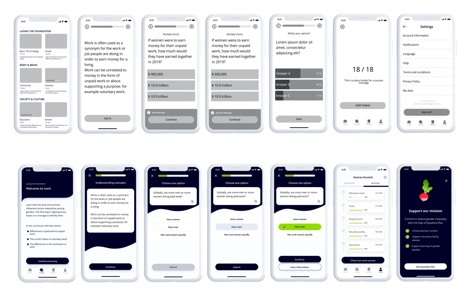
The before and after says it. Low-fi structure became the launch-ready product: Desiree Dazzled identity, illustration system, refined typography and the interaction patterns underneath it. I designed alongside the team and used every review to push the work further.
- Everyone has biases — including me. Naming them is the work.
- Designing for an audience this vast is hard. That’s what made it interesting.
- I love micro-interactions and microlearning. Here I got to build both into one system.
- Mentorship is design work. The teaching mattered as much as the screens.